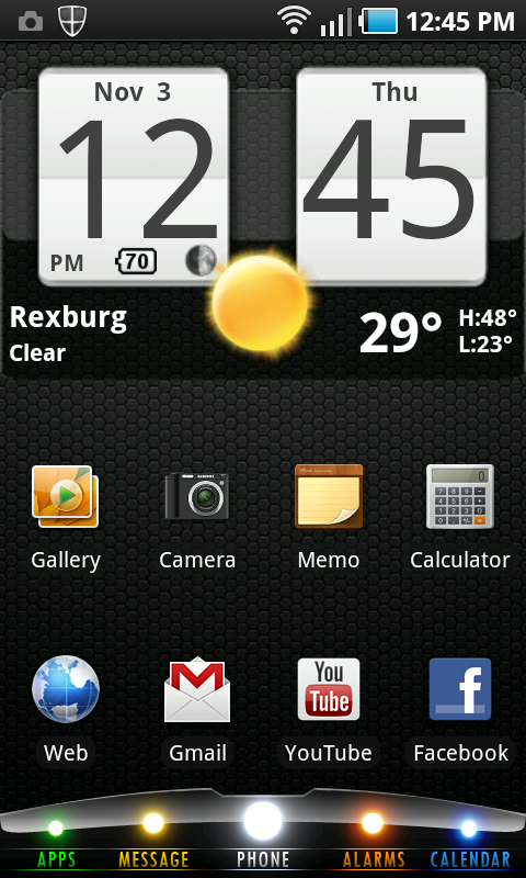
 Behold, my most recent 'tweak.' I made the dock at the bottom. Not the other things. Some slightly technical details: My android phone is a Samsung Galaxy S and my launcher program is called Launcher Pro. The launcher program is the reason I can customize the dock. So it's important. If you want, you can download Launcher Pro for free on the android market. It's been a good launcher so far. It seems to have a slightly more intuitive interface and allows a little bit more freedom than the default launcher.
Well, this story begins when I found out I can change the icons on the dock to whatever I want. All I had to do was save an image as a png file, get it on my phone and set the button as the image. Presto! So, I spent a bunch of time making my own icons and it was fun, but it was a pain if I wanted to change something major about the general look of all the buttons because I had to change each separate file so the look was consistent (I'm a little bit of a freak about visual consistency) and then set each image to it's button individually. I know. My life is a hard one. So, I was hunting around online for ways to customize my dock and found out a fun little method that a lot of people have been doing to make their dock look a lot more... customized? It looks cooler.
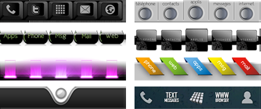
It's really simple. Set the individual icons to blank png files and change the background of the dock to something that looks like buttons. It functions the same, but it gives a little wiggle room for the icon design and placement. Here are some examples of stuff other people did. You can see some were designed to be the buttons and some were designed as just backgrounds for the icons to go on top of.
 So, I set out to make my own dock which I decided would best begin with a little online research. First I searched "Launcher Pro Dock" on google images and found the common dimension for this (480x84 px) Then google images has a beautiful little feature that will let you search for images of an exact size. (This eliminated all the questionable images of some random guy's phone wallpaper) That's where I got the images above. There were a ton more that I pulled my ideas from, but I don't think you really care to see them all. Next I decided it was time for some good old fashioned sketching. I'm curious to know how many people think that we who make these computer images don't ever use pencil and paper. I find it's a very good source of inspiration.
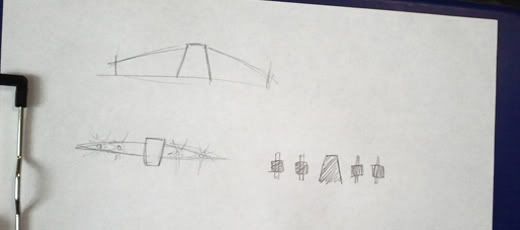 ...as you can see I didn't get very far before I started computerizing. I wasn't exactly sure where to start, but I knew I wanted a dominant center button and some serious glowy lights.
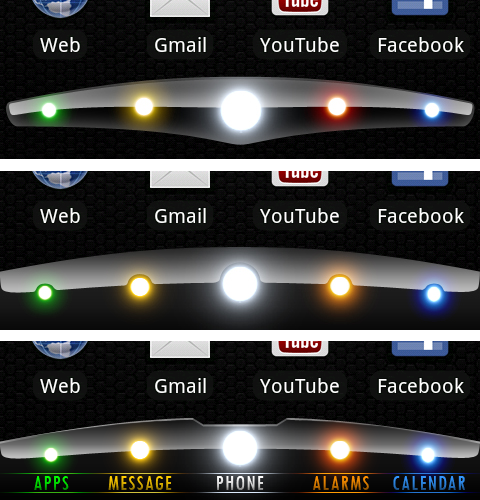 I started by outlining it's shape and naturally the glass-type shiney-ness followed. Here you can see a little of it's evolution as I played with it. I first tried the floating dock since that was pretty different than what I was used to and it turned out awesome! I was very pleased with myself because it looked really slick, but it just didn't feel very bold when I actually put it on my phone. So I made a version that filled the bottom. That was really good and I was like "Yesssssss" inside my head.
Then an odd thought occured to me. If someone needed to use my phone for some type of emergency, it would be kind of difficult to find the phone app especially if they weren't technologically savvy. (I actually thought of my Mom trying to use it. Probably because I think she'd have the most difficult time with smart phones in general. Let alone nameless buttons) So I decided to make it a little more user friendly. I'm not sure why, maybe it's a trend thing, but I wanted a font for the buttons that was a... vintage look? contemporary? classic? I'm not sure how to describe it, but I guess it speaks for itself because I nailed the look I was going for. (Art is so easy when the only person you're trying to please is yourself) Also, you can see from version to version that the colors or brightness of the buttons change slightly. I've found that different colors require different methods for making glowies because they either don't come out as bright or they just don't work altogether. I added an edge to the top to bring it out from the dark background I use and I took out a notch at the top to give it a little bit of an angular mechanical feel.
Well, this first post turned out to be a lot less like a tutorial than I wanted it to. I think I realized how much there is to explain and I wanted story in it too. No dice. So, I think I'll do stories like this and then do individual posts for different thing like creating shinies and glowies and the like in posts to follow.
So, hope you enjoyed that. Feedback the snot out of this!!! I want to write about stuff that's not dumb or boring.
Until next time, try to contain your insane anticipation
